Having a good logo is as important in forming your company’s image as it is to have a well-formulated business plan. There are some basic steps that you should follow before finalising a logo. These steps are necessary for multiple logo design choices and then finally selecting one out of many. Firstly, you should know what your company is about and then have adequate research on how other competitors in your niche have their logo designed. This is necessary to not end up with the same or somewhat similar logo to your competitors.

Keep it Simple (Stupid)

The old acronym, KISS or Keep it Simple Stupid. A good logo is simple and does not have too many elements crammed in. Simplicity in logo design means maintaining a proper balance between positive and negative spaces. Also, avoid overlapping shapes, and if your company has a tagline, then the logo should be designed in a manner that it looks simple and effective both with or without the tagline.

Colour Psychology

What good is a logo that can’t reflect the true nature of your brand? Colours play an important role, as they are associated with many connotations. If your business is associated with the environment or the mission of your company is related to creating eco-friendly products and services, green would be the ideal colour. Fast food logos usually have some, if not a lot of red, while a lot of tech companies are blue, blue is a standard colour for trust, and stability.

The Role of Imagery

The imagery comes into play with or without colour. When you are getting your logo printed in black and white, it is not the colour that will convey the story, but the illustration. Use appropriate imagery in contrast with your business niche.

It is important to keep the illustration original and get it designed first-hand to avoid copyright issues, even a simple swoosh, an apple, three lines, or the letter M might have a registered trademark or copyright against it.

A good layout
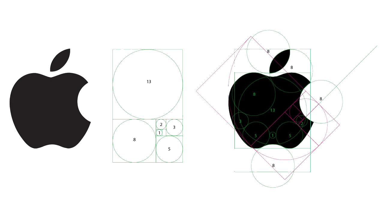
A well-designed logo has proper proportions beneath it. There are a lot of layouts that you can follow, from rectangles and squares to overlapping shapes. Some extremely famous logos are based on the Fibonacci spiral, Apple’s logo in one such example.

Works across different platforms and media
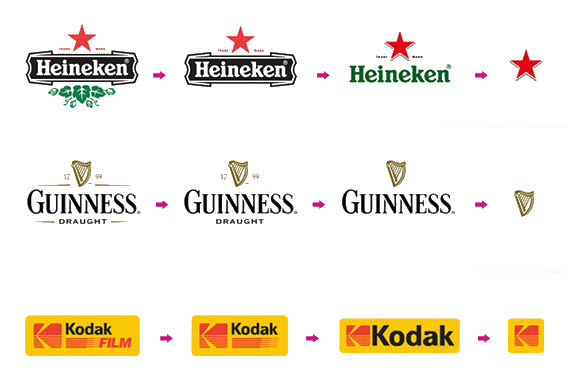
A good logo is one that is neither too small nor too large. When a logo is being made, its size matters because it would affect marketing across traditional and digital platforms alike. A complicated or very small logo would not appear or cause an impact on Instagram, for instance, as most of the users view Instagram on their phones. And it goes for the same for billboard prints or in magazines or any other form of media.

Appropriate font

Say your brand or business focuses on toys developed for small children. In such a case, a bubbly and colourful font would be more attractive to children and will convey the purpose of the brand. On the other hand, for a fashion brand, an elegant and simple font would be more appealing. Choosing the right font will create a different impression of what your business is. Subtle but strong.
Logo designing can get very tricky, so don’t leave it for yourself. It’s better to get a designer to do all the work. If you are looking for logo designer, then look no further, fun/serious provides logo design as part of the graphic design service offering.