
Here is a little back and forth on the design process with the latest logo design for a client. It gives you a look behind the curtain. I hope you enjoy. The name of the client is pretty much correct, but I had fun with their avatar.

Hi TJ. Here is the first round of your logo, the idea is that it is a card, or voucher, what do you think?


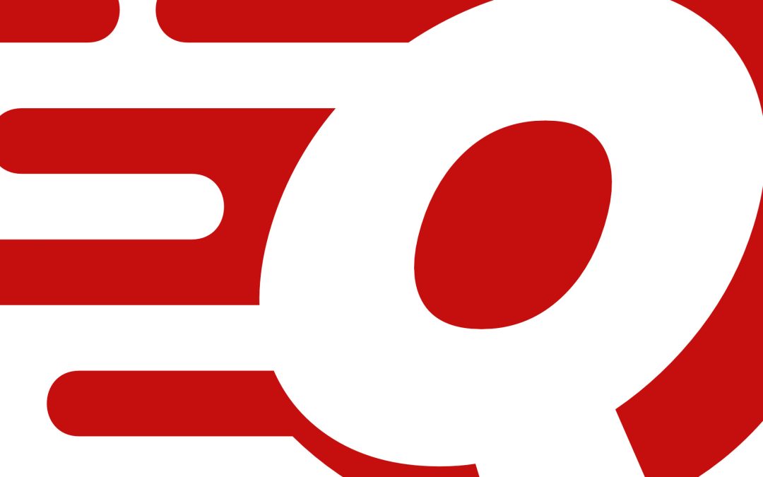
Hi Ben, I was thinking more of the logo of a Q like this?

No worries, here are two options for you, let me know which way we should move ahead.

I like the “i” in the second one, love the font too, yay!
Awesome, do you have a specific colour in mind?
Red.

Can the red q be the q in quikgift? And all letters in red please?
I got you fam! I have two options, but I prefer the first one.

Looks like target, needs to look less like the target logo. I don’t want them to come after me.

Is that target? looks like target.

Looks a little too much like target.
OK! OK! It looks like target, gimme an hour…
I got you fam!

Perfect, I love it! Approved.